3. Analyse in Supply and Demand.
As many of you have known for a long time, I am a true Supply and Demand trader.
Yet I am still often asked how exactly you make an analysis in Supply and Demand.
Now I will give you an answer to this in this blog.
First let me make it clear that Supply and Demand is NOT the same as Support and Resistance and therefore a different way of trading.
I also often use Support and Resistance lines in my trading, but in a different way than a Support and Resistance trader would use them.
I think the biggest difference between Support and Resistance and Supply and Demand trading is that with Support and resistance you assume levels that have been hit / tested more often and at Supply and Demand we prefer fresh levels!
How do I make my analysis in Supply and Demand?
Before we discuss anything else, we should define what supply and demand actually is.
In short: demand is how many buyers there are in a given market and how much they are willing to buy an instrument.
Supply is how many sellers there are in a market and how much they are willing to sell an instrument.
As I explained above, at Supply and Demand we are mainly looking for fresh levels and then we prefer a test / touch of the zone no more than 3 times.
After the third touch, the zone is actually no longer valid.
Or, in most cases, it will be very weak and unreliable.

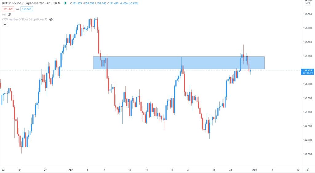
We see a nice H4 Supply zone in the image above.
We see here that there was not much “traffic” (candles) when the zone was created.
That already makes it a nice zone for me.
We also see that the price had already tested the zone once and fell again.
Now we see that the price went even deeper into the zone for the second time and then came down again.
In addition to the zone that I draw, I also often draw a baseline.
The baseline shows me even better where exactly the most important point is and is also very important to determine when I enter a trade.
But how do I find the correct baseline? I’m going to explain that to you now.

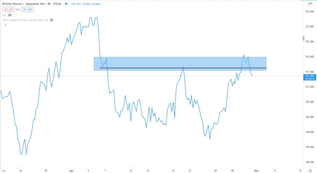
As you can now see in the image above, I’m going to go to the line chart to find the correct baseline.
I’m starting from the first point in the zone here.
You can also see this in the image.
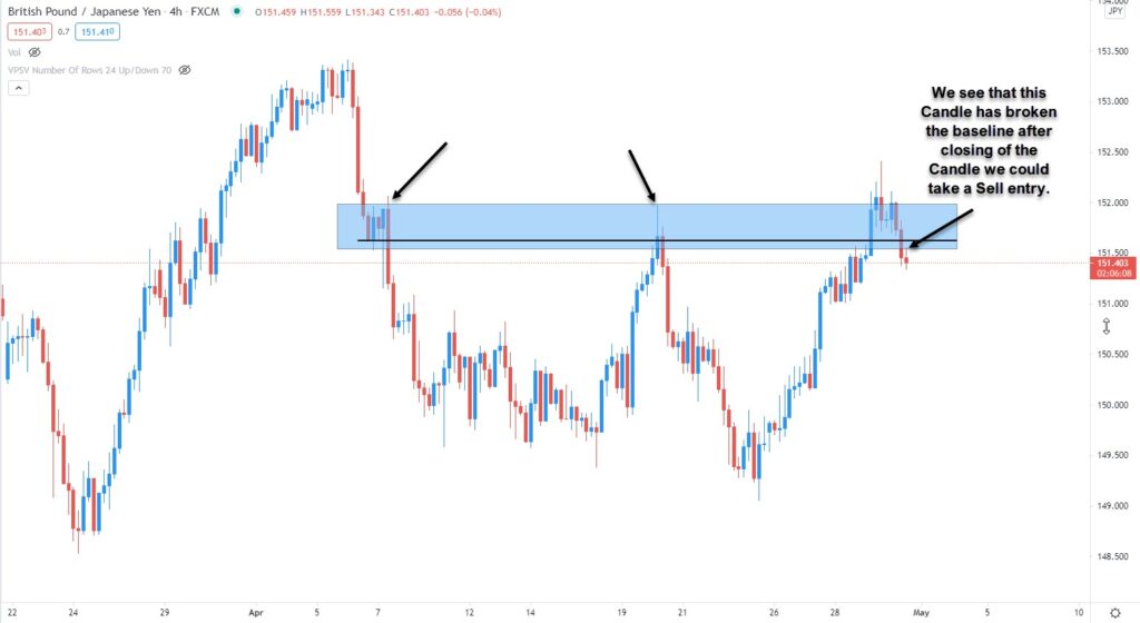
Now let’s go back to the Candle chart for a moment.

This is what it would look like on the Candle Chart.
And so we could expect a nice sell after breaking the base.
So this is in short how I make a simple Supply and Demand Forex Analysis.
But we cannot always make a successful trade with this alone.
For this we look at many more things, such as the volume, and we also switch back to lower time frames for an entry.
But I will explain all this to you in detail in the Supply and Demand Course.
Homework assignment.
Send me a print screen of a chart showing the correct Supply and Demand zone.


 Questions?