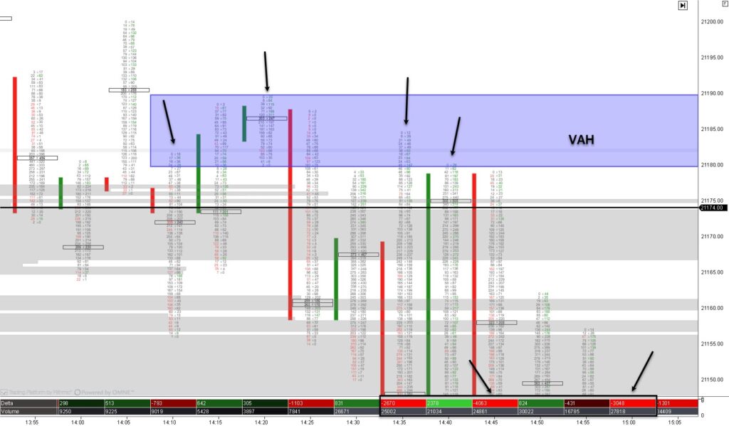
Footprint charts are like X-ray glasses for the financial markets. While regular price charts show where the price has been, footprint charts let you see what’s happening inside each price movement. They’re a powerful tool in order flow trading that helps traders analyze the activity of buyers and sellers at specific price levels.
Here’s how they work in simple terms:
A footprint chart breaks down each price bar (or candle) into detailed information about trades. Instead of just showing if the price went up or down, it displays how much buying and selling occurred at each price level. Think of it as a zoomed-in view of market action.

The key components of a footprint chart include:
- Price Levels: Each row on the chart represents a specific price. This shows you where the market traded during that bar or timeframe.
- Volume: Footprint charts display the number of contracts or lots traded at each price. This helps you see where the most activity happened.
- Bid/Ask Data: You can see how many contracts were bought (ask) versus how many were sold (bid) at each price. This helps identify imbalances, which occur when buying or selling dominates.
- Delta: Some footprint charts also show the delta, which is the difference between aggressive buying (market orders to buy) and aggressive selling (market orders to sell). A positive delta means more buying pressure, while a negative delta indicates more selling pressure.
Why use them? Footprint charts give you a deeper understanding of market behavior. They help you spot key levels where big players are active, identify fake moves, and decide whether buyers or sellers are in control.
In short, footprint charts are an advanced tool that helps you trade smarter by revealing the hidden story behind price movements. So this is perfect for traders who love details!


